smartwatch ui
For this project I had to come up with a unique idea for a smartwatch app which I had two weeks to fully complete the project.
Brief: Create three high resolution mockups in figma
• Discover (Desk), Develop (Sketch), Outcome (High Resolution)
• Consider colour and a name
• Consider presentation
Research
As I do not own a smartwatch myself I started with research to fully familiarize myself with how UI/UX looks on a smartwatch which I documented a competitor analysis on my Notion blog.


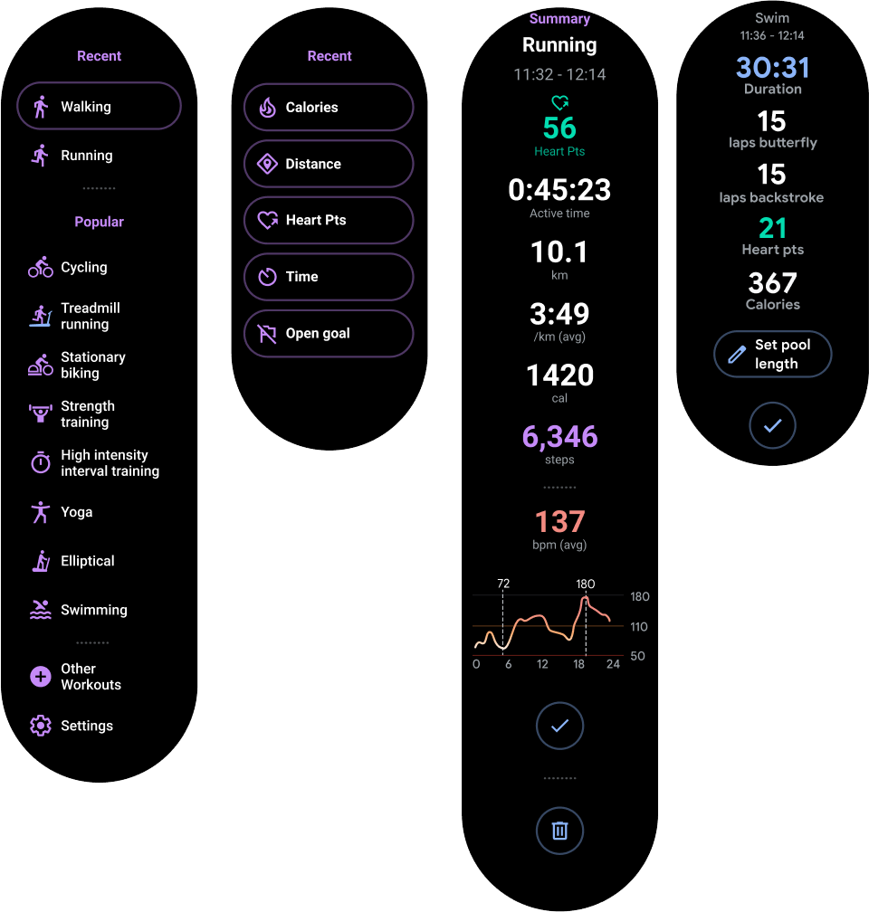
A trend I noticed when researching smartwatch apps was that they use dark backgrounds with white text with nice contrasting colours. I think using white text on a dark background would really help the user with readability, especially with the screen bring so small.
I then needed to come up with a strong idea for my app. I noted down some concepts then I had to then pick a favourite of what I think would work best on a Smartwatch.
The main obstacle for this project was having limited space which I had to plan on what I could include on each page without being too cluttered or even being too hard to read. This also included what information could be a universal icon/button to save space.
After my planning I decided to go ahead with my app for Bonsai Tree care as they are so delicate. A guide would be great to keep the user right to ensure a tree dose not die for something so simple such as forgetting to water. I plan for the app to track the trees sunlight, soil moisture and the room temperature which are all very important and can change depending on the time of year.
My idea would help both new and professional Bonsai hobbyists giving them ease of mind with reminders and step by step guides. This is something I would use myself as for example during summer leaves can burn and in winter cold temperature can be vital.
This idea would work well on a smartwatch specifically as the user could be holding tools to care for their trees, so being on smartwatch the user can see live updates as they are working on their trees.
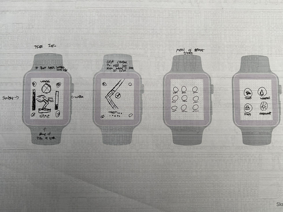
With a solid idea in mind I then started sketching layout ideas for the different pages I plan to include in my app with variants of the same type of page.


User persona
With a solid idea I then created a user persona to get a stronger idea of ‘humanized’ needs and wants and how to make it convenient.
Alex is a dedicated bonsai enthusiast who manages multiple indoor and outdoor bonsai trees, each with specific and varying care requirements. Some trees need high sunlight exposure, while others are sensitive to cold temperatures and must be monitored closely.
Because Alex frequently cares for his trees while using tools or carrying bonsai between locations, his hands are often full. This makes interacting with a phone impractical during care routines. He needs quick, hands-free access to essential information.
Alex requires a solution that:
-
Tracks individual water levels, room and outdoor temperatures, and sunlight exposure for each bonsai
-
Provides timely smartwatch alerts to prevent under-watering, overexposure, or cold damage
-
Supports pruning reminders and care logging without interrupting physical tasks
-
Reduces the mental effort of remembering the unique needs of each tree
Overall, Alex needs a glanceable, wrist-based system that helps him confidently care for a large and diverse bonsai collection without slowing down his workflow.

Wireframing
This was the halfway point for this project which I had the lofi mock up created to receive feedback on my idea and layouts. This is one of the most crucial parts of my design progress to understand what works and what could be changed in my idea.
Feedback
During the session I explained my idea and the different screens and how the app will colour code warnings for the trees health.
I also expressed my concerns for the 'pruning coach' as it was heavily text based which is not ideal for such a small screen. I was recommended to remove it and replace it with a more 'fitting' screen such as a warning page.
I received other feedback to remove the four corner buttons, which was something I noticed on smartwatch screens in my competitor analysis. I was also recommended to change the layout of the bars in the 'Tree Info' page for better readability.
Mock-ups
To apply my feedback I removed the pruning coach app feature page which was too complex and added the new 'warning' pages to replace it with. I also redesigned some elements of the pages I would keep, just making them more visually appealing for better readability.
In the warning page I made the app tell the user what is wrong with a recommendation. In this page I also added a 'tips' button so the app could tell the user what to do to help the tree.
During the second week I also created a set of illustrations for the trees using Adobe Illustrator. I made sure the illustrations were simplistic but identifiable to the species of tree as on such a small screen as I could not type out the full name of the tree.
Unfortunately as I do not own a Smartwatch myself I was unable to test this on the device it was built for so I used the Figma smartwatch prototype to visualise it, as on desktop text can look a lot bigger than what it would appear on a smartwatch.
Deliverables
This was the deadline and final critique for this project which I am very pleased with my final design. During the critique I was praised for applying the feedback from week 2.
Overall I am very proud of myself for the work I had completed in two weeks, from the idea generation to the final design. This project has demonstrated my time management, idea generation and the ability to apply feedback.
.jpg)