_edited.jpg)
Online bank brand
For this project I had to create my own commercial brand for a modern bank. This project more focused on branding rather than UI/UX design as I had to rebrand a exciting bank app layout. The target audience for the bank was 16–25-year-olds which with this I had to consider what would make my brand different than others. I also had to create brand guidelines and a website landing page.
Research
Before going right into planning I started with a competitor analysis which I visited different bank branches in Belfast to gather information for example their branding and observing the customers age range.
With the age group being a young adult audience, I was also able to interview students at Ulster University about this topic and what issues they have with online banking. This gave me a better understanding of needs, wants and pain points of existing bank brands. I also added questions regrading a topic me and my friends had discussed even before this project was handed out.
With this, I was also able to create a user persona to help better understand my target audience, in this case, a university student. This helped me tailor my online banking brand’s design, features, and messaging to meet their needs.”


planning
After I had a better understanding of bank branches and my target audience I started thinking about ‘what would make my brand 'different than others’.
After some thinking and looking at my feedback responses, I went with a concept to help Uni/Higher education students manage their student loans. As it is all paperwork this would be a good way to remind students how much money they own and how much they would eventually pay back.
Starting University I was very unsure myself of and forget how much money I was getting paid and how much money is temporary and will later pay back. To remind myself I would check paperwork but this was not very convenient and required some working out. With different expenses and trying to save money it is quite difficult to work out how much money I actually own and how much I will have to pay back in the future. This is the main pain point I wanted my app to solve.
Both student loan and finances were also labelled the same in my banking app so it was very confusing which was what.
This would solve maths, help students to spend and save responsibly and better awareness of student loans (no more paperwork).
As this project was heavily focused on branding, I also had to consider brand values, personality, and how my brand would make the customer feel.
.png)

To create a memorable logo, I created a custom wordmark using 'Ubuntu' from the type list with a rounded diamond shape tiddle to keep in theme with the values (safe and secure).
For a logomark I wanted to create something to reflect ‘Unity’ which I went for a 'infinity' type logo. I first sketched out different ideas using a U to build the logo with then digitalised them and build a nice looping logo. The middle reflects the diamond with arrows pointing towards it to tell the user 'this is how you would feel' (safe and valued).
At this point most of the branding was complete I just needed to create a colour palate. I tested a wide range of colours using my logo even combining some colours together. I choose to go with a light teal blue to reflect trust and sticking with the ‘diamond’ theme (this was updated a few times due to colour contrast to ensure it was accessible for all users).
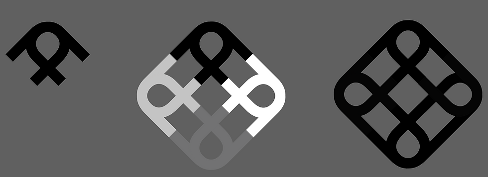
creating a logo


To create a memorable logo, I created a custom wordmark using 'Ubuntu' from the type list with a rounded diamond shape tiddle to keep in theme with the values (safe and secure).
For a logomark I wanted to create something to reflect ‘Unity’ which I went for a 'infinity' type logo. I first sketched out different ideas using a U to build the logo with then digitalised them and build a nice looping logo. The middle reflects the diamond with arrows pointing towards it to tell the user 'this is how you would feel' (safe and valued).
At this point most of the branding was complete I just needed to create a colour palate. I tested a wide range of colours using my logo even combining some colours together. I choose to go with a light teal blue to reflect trust and sticking with the ‘diamond’ theme (this was updated a few times due to colour contrast to ensure it was accessible for all users).


branding
At this point I had a solid idea on the direction I wanted to go with this project which I then had to come up with a brand name, typeface, colour palate and logo.
When searching for a typeface I wanted something I could also use the letters to build a logo out of. I ended up using the typeface ‘Ubuntu’ which has a friendly professional look to it which mixes curves with sharp edges.
To come up with a brand name I created mind maps and combined words and ended up with the name ‘Unifi’ (which later became Unify after feedback).
My brand values for my bank brand included:
-Transparency (Open and honest, no hidden fees)
-Security (Knowing finances are safe and well-managed.)
-Connection (Part of a financial-savvy student community.)
-Valued (Feeling like the Users financial journey matters.)
-Trust
The brand will make the customer feel safe and secure that my online bank will safely store their money and make the customer aware of their loans. My customers will always feel valued, safe and less stressed with the help of my banks features.


brand application
With a solid brand in place, I then experiment adding my design choices to mock-ups to see how it would look on physical products.
app design
As previously mentioned for this project I just had to redesign a existing banking app and apply my brand to it. I did make some changes for what I thought was necessary for my brands goals and concept by creating my new 'student loans' feature.
For the app redesign I also had to think of icons which I sketched out variations and picked my favourites to digitalise and use in my apps UI.
As previously mentioned for this project I just had to redesign a existing banking app and apply my brand to it. I did make some changes for what I thought was necessary for my brands goals and concept by creating my new 'student loans' feature.
This new page would allow the user to set weekly budgets with a button for insights, loans, smart save and more options. This page will also tell the user how much of their money is from loans.
For university students, a clear weekly budget bar could be especially helpful. When for example they go out clubbing, it's easy to spend a lot in a single night without noticing. A large, visual budget indicator would help them keep track and avoid overspending.
For the app redesign I also had to think of icons which I sketched out variations and picked my favourites to digitalise and use in my apps UI.
This project also introduced me to components in Figma which I created 'on press' components to my buttons as it is a mobile app. This made my prototype more interactive and felt more like a real app.
I also added a simple home button as the app I was using for reference was missing this which the user would have to tap 'back' over and over to get back to the home page.
When prototyping my app I was constantly checking it on mobile to ensure everything was scaled and positioned well, as well as making sure all buttons worked with the component interactions.


.jpg)


BRAND GUIDELINES
During this project I was introduced to brand guidelines. This required me to document all my design choices to produce a clear, fool proof guide for any designer working with my branding.

LANDING PAGE
The final section of this project was to create a landing page web page to introduce my bank brand to the user, as this would be the first thing the user would typically see.
I started with sketching out different layouts for the landing page before creating a wireframe in Figma. I also planned for different sections I wanted to include what would be important such as customer reviews to give new users reinforced trust that their money is with someone safe.
I also took this as an opportunity to include features of the brand which could not be included in the app. I originally wanted my app to benefit the target user (students) which my brand gives users perks such as free event entry excusive perks.

deliverables
This project has taught me a lot from in depth research to how to create strong brand guidelines. Competitor analysis, observing and interviewing were all very helpful research techniques.
I think my branding worked very well on this project as everything linked together going back to the brand values. I really liked applying my branding to mock ups which I am especially happy with the 'U' shape business card and the bank card I created
I did have a few obstacles during this project such as my idea getting criticised which I remained passionate about it, and I think my outcome proved my idea worked.
If I was to redo this project, I would prefer designing my own app layout rather than redesigning or even redesign a different app than what I went with. I would also like to create a full flow for the user adding their loans, however this was not necessary for the original brief submission.
