Music player app
For this project I had to create a music player app with a fully working prototype in Figma.
Brief: Three Screens
• Home (Launch Screen)
• Playing Music Screen
• Detail of UI (Playlist, Lyrics)
• Working Prototype
RESEARCH
To begin this project, I started by noting down different ideas and turned them into mind maps of what features, styles, genres etc the app could cover. I wanted to create something more unique than Spotify and Soundcloud.
After reviewing and considering my different ideas I decided to go with the music player app for film composer, singer and songwriter Danny Elfman. I went with this idea as Elfman covers a wide range of music genres, and I wanted to challenge myself to create an app in his style.
Elfman does many concerts in the USA and sometimes tours but there is never a option to rewatch his concerts digitally, which is a massive paint point especially for his international fans. I plan for my music player app to resolve this issue by including a page for upcoming events for awareness and past events the user could listen too.
With a idea in mind I then created a mood board/ competitor analysis of existing music apps and Elfman content such as his branding.
To begin this project, I started by noting down different ideas and turned them into mind maps of what features, styles, genres etc the app could cover. I wanted to create something more unique than Spotify and Soundcloud.
After reviewing and considering my different ideas I decided to go with the music player app for film composer, singer and songwriter Danny Elfman. I went with this idea as Elfman covers a wide range of music genres, and I wanted to challenge myself to create an app in his style.
With a idea in mind I then created a mood board/ competitor analysis of existing music apps and Elfman content such as his branding.


Now that I had gathered visuals and inspiration, I started to sketch out some layout ideas of the different screens (set 3 was used).

Set 1


Set 2


Set 3


I also noted what icons I would need which I sketched out different versions. I wanted to create unique icons to stick with Elfmans edgy surrealist style so I went with sharp edges and skeleton style icons. While I wanted to have fun with the icons I also ensured that they would still be universally recognised.

WIREFRAMING
With research and sketches I started wireframing my ideas. My first wireframe was very basic and looked too similar to Spotify so I then wireframed one of my more unique layouts.


The new layout (Set 3) looked lot better allowing me to feature more pages in a simple seamless way to include ‘music, ‘concerts’ and ‘podcasts’ in one navigation bar. I also wireframed more unique ideas such as the skeleton search page however I thought it was probably too much.


BRANDING
At this point I wanted to create the brand before starting to create the mock ups. The first thing I wanted to consider was the app name. I combined different words and looked at Elfmans work to create the name which I settled on ‘Elfmanic’ which combines ‘Elfman and ‘Manic’. I went with this as I found the word ‘manic’ meaning ‘showing wild, uncontrolled excitement and energy’ describes Elfman and his work pretty well.
Next, I wanted to create a colour palate for my app. As Elfman is edgy and gothic, I wanted a dark tone to be one of the main colours for the backgrounds of my app. Looking at Elfmans own branding red and yellow were also used which I went with using red as it would be easier to work with such as adding text over the red. I also ensured all colours passed the accessibility contrast test.
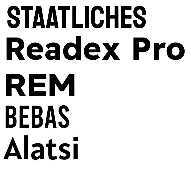
The last decision I needed to make before going to the mock up was selecting fonts. To do this I created type shortlists of fonts I liked and experimented using them by typing out the apps name. I settled with Readex Pro bold for headings and Roboto for content. I also made my own version of Elfmans custom typeface for the wordmark.

At this point I wanted to create the brand before starting to create the mock ups. The first thing I wanted to consider was the app name. I combined different words and looked at Elfmans work to create the name which I settled on ‘Elfmanic’ which combines ‘Elfman and ‘Manic’. I went with this as I found the word ‘manic’ meaning ‘showing wild, uncontrolled excitement and energy’ describes Elfman and his work pretty well.
Next, I wanted to create a colour palate for my app. As Elfman is edgy and gothic, I wanted a dark tone to be one of the main colours for the backgrounds of my app. Looking at Elfmans own branding red and yellow were also used which I went with using red as it would be easier to work with such as adding text over the red.
The last decision I needed to make before going to the mock up was selecting fonts. To do this I created type shortlists of fonts I liked and experimented using them by typing out the apps name. I settled with Readex Pro bold for headings and Roboto for content. I also made my own version of Elfmans custom typeface for the wordmark.


MOCKUPS
With all my design choices made I started creating mock-ups. I also gathered a range of images to use for my apps UI such as album covers or photos of Elfman himself. I was also able to use some of my photography and editing skills in this protect to create my own albums using photos I took at an exhibition.
For the ‘music playing’ screen I originally planned for it to play a animated sequence in the background which I did get to work however I removed this for a more unique idea. During this project I learned of components in Figma so I was able to create one of my original ideas of a spinning vinyl record with its album.
I digitalised my icons and illustrations to add to the mock up using Adobe Illustrator. I went with the most simple and understandable icons but still added the 'edginess' to them using sharp corners and bones.
When creating the mock ups and prototyping the screens I constantly checked how it looked on the device it was made for itself, to ensure everything functioned and read well on a mobile device.


With all my design choices made I started creating mock-ups. I also gathered a range of images to use for my apps UI such as album covers or photos of Elfman himself. I was also able to use some of my photography and editing skills in this protect to create my own albums using photos I took at an exhibition.
For the ‘music playing’ screen I originally planned for it to play a animated sequence in the background which I did get to work however I removed this for a more unique idea. During this project I learned of components in Figma so I was able to create one of my original ideas of a spinning vinyl record with its album.
I digitalised my icons and illustrations to add to the mock up using Adobe Illustrator. I went with the most simple and understandable icons but still added the 'edginess' to them using sharp corners and bones.


CONCLUSION
I am very happy with this project which it came out much better than I first thought it would.
This project I challenged myself to design something based on a person and their style. This project was one of those ‘made by a fan for the fans’ as I wanted to include other useful elements than just music such as Elfmans upcoming events and the feature to watch the recordings from the events which is currently not available. I also got to apply more of my skillset to this project using Adobe Illustrator, Photoshop and Lightroom.
I originally sketched and digitalised layouts and recognised they were maybe too similar to existing products and went back to make something completely unique.
