Sustainable Development Goals
For this project I had to pick one of the 17 SDG goals and create a app for a child audience. This is a audience I previously had not designed for so I was excited for something new for this project.

SDG research
To begin this project I want to start by looking into the different SDGs and what they are all about before choosing one just because of the title. The original one I leaned towards in class was ‘life underwater as wildlife protection is something I really care about which this would cover both marine and climate change.
I then went to the official SDG website to investigate other options I can use for my project. In this I read the short bios for each SDG and looked at the charts displayed which showed the real world problems, what it would look like in the future with no help, comparing it to how it is currently going with the help of the SDG goals.
The next SDG I looked into was 15 ‘Life on land’ which aims to Protect, restore and promote sustainable use of terrestrial ecosystems, sustainably manage forests, combat desertification, and halt and reverse land degradation and halt biodiversity loss. It also highlights that in 2020 17.6% of land is protected and by 2030 they aim to protect 30%. Targets for this SDG include reforestation, conservation of mountain ecosystems, reduce degradation of natural habitats, end poaching and many more. This is something else I would be interested in covering.
Ideation
From this research of some SDGs which interest me I then wanted to start thinking what I could actually create for this project. This project is quite open for what I can design such as a physical product, game or a app. This also means I can apply my other skills such as animation or photography/editing which I don't get to typically use in Digital Design course.
I then took my ideas to paper which I brainstormed some ideas on ‘life on land’ which I wanted to focus on endangered animals which covered poaching and deforestation which are both mentioned in that SDG.
I planned for some app pages such as a map to display a map pinpointing registered animal Sanctuary's so for example if the user is planning on going on holiday somewhere they are supporting the right people, as their is a lot of bad ones too. With this idea I could also bring my image editing skills into it. Below is the paper I noted my idea down on which I am quite happy with it I just want to run this by my lecturer in week 4.
Diving into sdg 15 - Life on land
I wanted to highlight the specific targets of SDG 15 I would want to include/reference in my app. While kids cant directly stop poaching it is important for them to be aware and to care about these animals, then possibly do more to help in the future.


Idea redesign #1
Originally when the brief was given out for this project, it was not clear that it had to be exclusively for a 'Primary School child' audience. So I confirmed that it had to be which caused me to redesign my idea as it did not fit with the target audience.
Now that I am certain that this project had to be designed for a primary school audience I had to come up with a new concept. I started by looking at past students work to get a better understanding of what this could look like. I noticed quite a lot of apps were quiz based which is a good way to educate children on SDGs however I do think a simple quiz is quite boring and could only interest kids for so long until it would become boring/repetitive.
For something aimed at a kids audience I think a interactive game, possibly including a quiz in it with rewards would be more interesting for the target audience as I would want to make something the user would want to come back too.
Looking at my original plan it was heavily focused on poaching which was also linked to deforestation. However I think poaching could be hard to illustrate for a app designed for kids which it could look quite dark. I think for a app aimed for a primary school audience deforestation would be a good choice as it also effects wildlife such as destroying the animals homes.
To educate children of the SDG I also plan to include a ‘warning’ section on the home page with real world updates such as newly endangered animals with information. As well as this I plan to include mission brief and debriefs to tell the user what's wrong, what they are going to do to help and how they helped and all the good it brought.
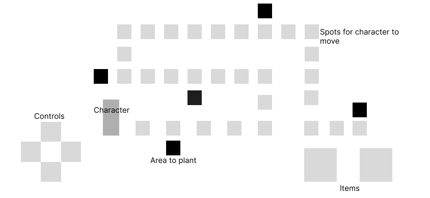
The concept for the game would be that the user controls the character through the map and has to plant trees in the highlighted areas. Interactive elements would include character move controls, buttons to plant and water (possibly including more similar minigames such as ‘animal rescue’).
To keep the user engaged I would include rewards such as stickers, animals and the users own lands (a collection of locations the user has saved such as a forest which the animals they save move in to).

Idea redesign #1 mood board

I then created a mood board to show the direction I wanted to go with this app including art style, characters and enviroments.
Idea redesign #1 Sketches


Idea redesign #1 Wireframes
With different Orientation's of my idea sketched I decided to go with the landscape version. I decided to go with this as it was less cluttered while making the game more simple to understand with more room for clear navigation.
Landing page
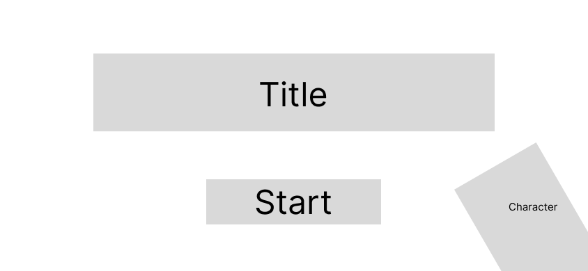
Home screen
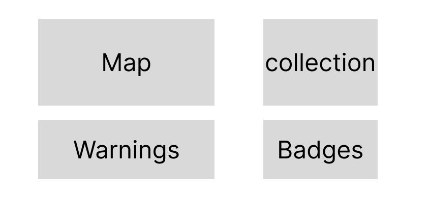
Level Select
Reforestation game

Q&A Quiz
Level Complete
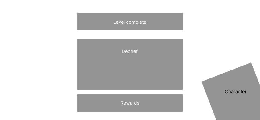
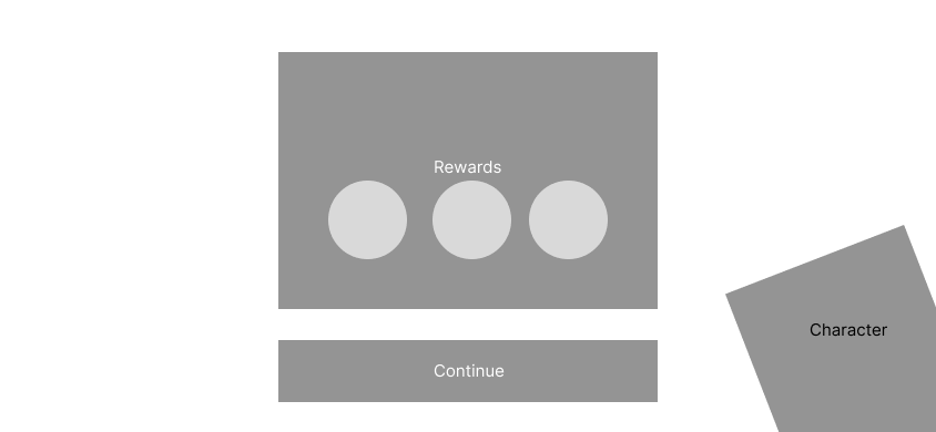
Rewards
Feedback
In week 5 of this project I received feedback on my new idea which I also go to explain my original idea and how I tired to rework it into a app for kids.
During the feedback session I explained from the start and where I am now with this project showing all my paper notes and sketches of everything so far.
My lecturer said it would be good for me to focus on poaching as it is such a big ongoing issue. I explained my concerns with this which my lecturer helped me think of ideas on how this would be presentable to kids for example it could just be a sad lion, no guns or anything ‘dark’.
I was also recommended to change the character to a real person not a robot, which I think for this idea does work a lot better adding a sense of 'realism' to it.
My lecturer also said that people hear ‘make a app for kids’ that it must be a type of game however he said it could be a interactive narrative for example.
Idea redesign #2
With my feedback I wanted to explore more options, I really liked the idea of a interactive narrative as I was falling down the trap of 'it needs to be a game'.
At this point I also realised I needed to take a step back and do a deeper dive into my research to understand the topic better and how it can be presented to kids, as well as understanding the user more, what do they know and what do they not know about this topic? How can I make a impact to make the user help with 'Life on land'.
When researching into animal poaching education for kids I found this website which explains poaching and its negative effects to kids. There are also more topics covered about protecting wildlife as well as other SDGs and the general ‘life on land’.
https://kids.earth.org/life-on-land/poaching
After struggling with thinking of ideas and continuing this design I came up with a whole new concept which is very similar to my very first idea more of a information based visual app rather than a full game. For this app it would be targeted for 10-11 year old audience.
This app would include a quiz which would first play a video or slideshow with short text and images covering why poachers poach and why it needs to stop (why elephants need trunks etc). At the end a short quiz will test the users knowledge to see what they learned from the video. Completing the quiz would also reward the user with badges or a level to get the user excited and want to continue the app.
I planned for screen to show animals which are currently endangered which would update in real time. It would display information such as how many are left, why they are getting poached and what or who is helping them. It will show positive and negative updates and could send notifications for real world updates.
A ‘take action’ screen was also planned to educate children on what they could do to help such as throwing away their rubbish (not leaving or throwing it outside), reducing pollution, creating educational crafts (Such as drawing a animal to help spread awareness to their friends and family). In the take action I could include crafts to spread awareness, a ‘remember too’ section including topics such as towing away rubbish, recycling and turning off lights and how they help animals.
Competitor/Poaching Analysis
with a new idea in mind I then started with a new competitor analysis to research how this topic is presented to a child audience.
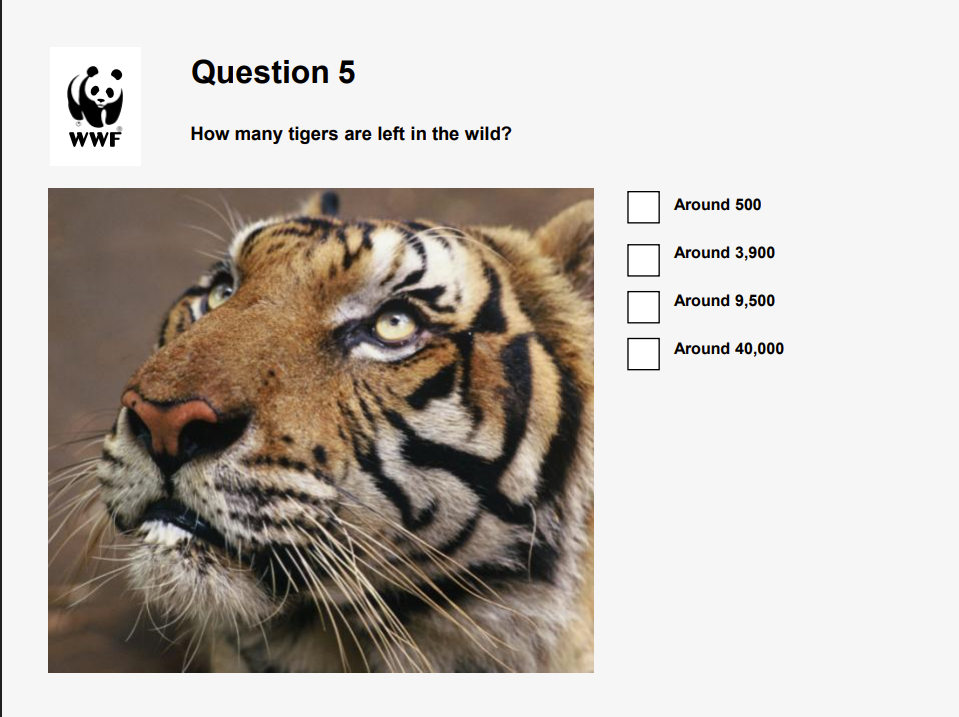
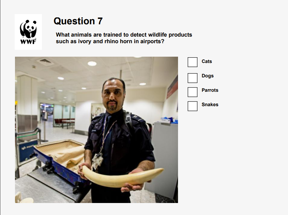
I found a quiz by the WWF about the illegal wild life trade which uses a short slideshow video then quizzes the user to test their knowledge of what they learned from the video which is similar to my new idea.
Something to note from the quiz was how simple words are used, for example ‘around’ is used instead of ‘approximately’. This is something I need to keep in mind for when typing out the content in my app, making sure words are both understandable and easy for the child to say.
The quiz does not use any graphic/disturbing images the only really ‘bad’ image they use is someone holding a elephant tusk. The rest of the imagery shows wild animals with no harm or danger towards them.
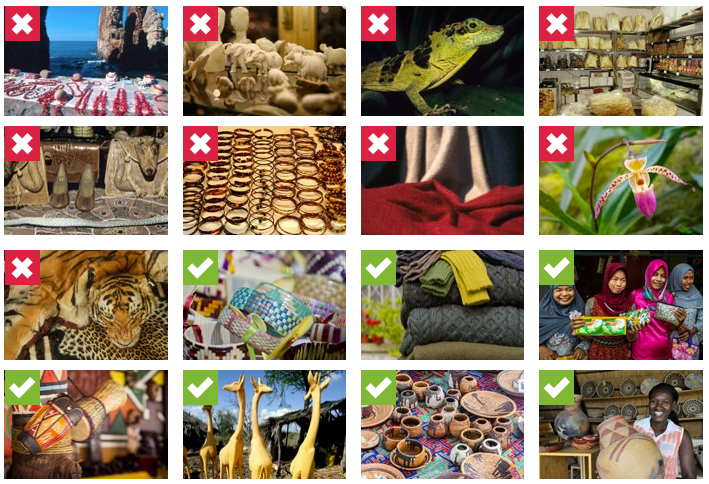
Another site by the WWF for ‘school activates’ reuses some images but adds in some more. The image below shows what holiday seveners are bad and which are good (Animals vs handmade/recycled goods such as wooden ornaments). This site does use slightly more disturbing images which it shows tiger pelt.
Another site they use has a illustrated map with information and animals which is something I wanted to include in my app but I plan for mine to be more interactive.
I also found a page titled ‘5 Tips To Teach Kid’s About Endangered Animals’. This includes lots of my initial ideas for my new app concept such as ‘Make a list of all the things that you can do as a family to help endangered animals’ or ‘Endangered animals crafts’. This backs up my ideas for these being good ways to educate children which the website also lists ‘Children’s story books’ which links back to my lecturers feedback on my new idea as he suggested me to create a comic to educate children on the topic.


Another site I found was on ‘how kids can save wildlife too’ by Bournemouth University. Researchers surveyed children aged 10-16 in three countries: the UK (England), Kenya and South Africa, which the focus was on their understanding of wildlife, specifically the role of elephants, and their attitudes toward conservation work.
In the research they found that many children did not understand the ecological importance of elephants or other species for example how elephants benefit ecosystems. The children across all three countries also lacked a clear understanding of the threats elephants face (e.g., poaching, habitat loss).
The researchers argue that environmental and conservation education needs to start earlier (in schools) and be more comprehensive, not just locally but globally, and across species (not just flagship ones like elephants). The researchers explained that if children don’t understand high-profile species, then smaller or less glamorous species are even harder to protect. This would be a good detail for my app to ensure that a variety of species are included and not just what you would normally hear about.
If education doesn’t sufficiently equip young people to understand, care about and act for wildlife, efforts to conserve species may become harder or less effective.
https://www.bournemouth.ac.uk/news/2023-07-13/study-shows-kids-can-save-wildlife-too
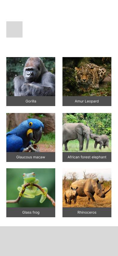
This was very useful for me to think of what animals are endangered/poached what would not be flag shipped. Just by quick research I found that Glass Frogs (taken from the wild for the exotic pet trade), Pangolins (pangolin scales are believed to have medicinal properties) and Helmeted curassows (hunted for food and traditional jewellery; their skulls and eggs are sometimes kept as hunting trophies) are all endangered animals in 2025 just to name a few.
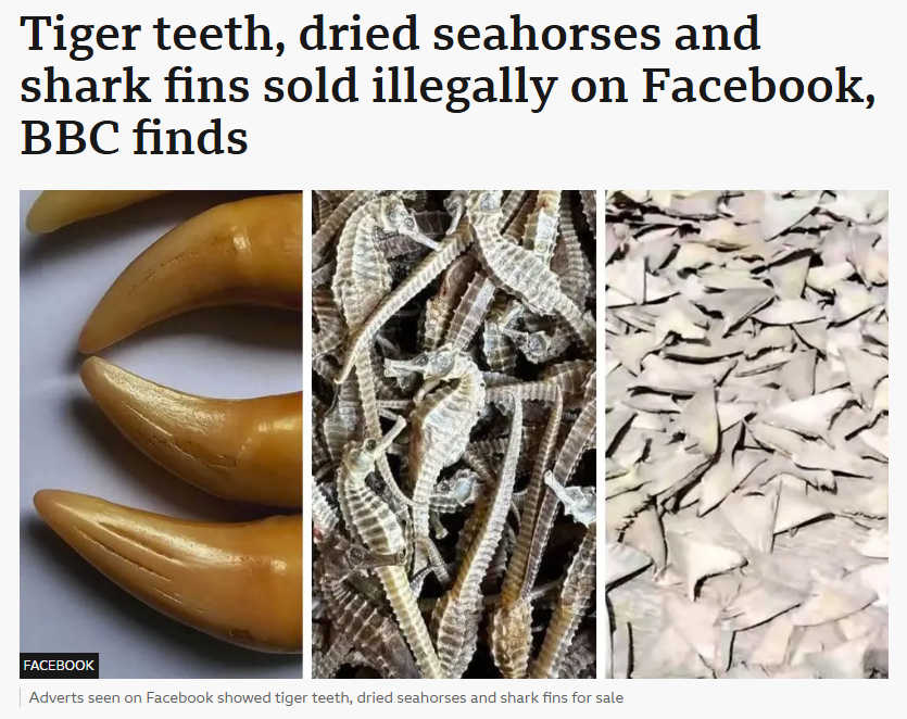
During my research I watched various topics from the news to documentary's about poaching/ Animal trafficking. One news article which was broadcasted on TV was talking about the illegal wildlife trade going on on Facebook and what people were selling and why. Why this is something I may not directly mention about Facebook it is still animals being poached and highlights that this is a ongoing problem, which the news tested this and found it very easy to access to buy from these illegal traders. This news article also mentioned the Pangolin which was good as previous to this I was not even aware of what they were not to mention how they are the most poached animal.
User persona
With more research I wanted to create a user persona to help understand user needs, wants etc from what I have found.
From this, Leo needs a child-friendly and engaging app that helps him understand wildlife conservation in a simple and hopeful way. He needs clear information about endangered animals—especially lesser-known species—presented through fun visuals, stories, and interactive activities. The app should explain why animals are endangered, introduce the problem of poaching and habitat loss, and show Leo small, age-appropriate actions he can take to help protect wildlife. Most importantly, the app should turn his sadness into curiosity, learning, and motivation to care about Life on Land (SDG 15).

Sketching
Now that I had completed more research I started to sketch layout ideas which the main focus will be the map which I think splitting it into continents as ‘levels’ is a good idea for the target audience. This would add more education of awareness of where these animals are located.


Sitemap
With this I then created a sitemap to go into detail of how the screens will change and more detail of labelling different elements such as buttons, titles, interactive elements etc. This was to show how exactly my app will flow on paper before bringing it into Figma to create a mock up wireframe.


Mockups
With this I then created a sitemap to go into detail of how the screens will change and more detail of labelling different elements such as buttons, titles, interactive elements etc. This was to show how exactly my app will flow on paper before bringing it into Figma to create a mock up wireframe.
Home


'Level select'
Level intro
Information
Quiz - Question
Quiz - Answer


Animals
Animal Intro
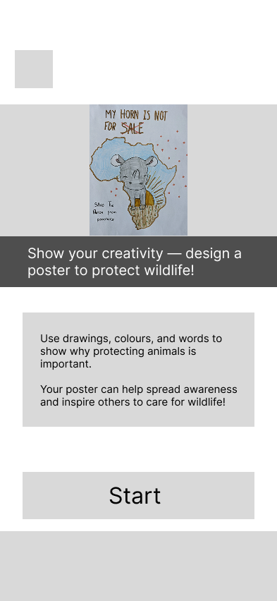
Activities page
'Create a poster task'
Feedback
At this stage I received feedback on my project. Before receiving feedback I knew that the main issue of my wireframes so far was too much text for the target audience.
A summary of my feedback was to use less text at once and spread content out with large images, inspired by National Geographic. Make information more visual with charts instead of heavy text. Consider adding an interactive “take action” button (e.g., printable awareness sheets). Build on strong visuals like your map research, and explore a colour-splash design to highlight key info. Keep text shorter and more user-friendly.
I was also recommended to bring my content to a bigger screen.
Feedback research
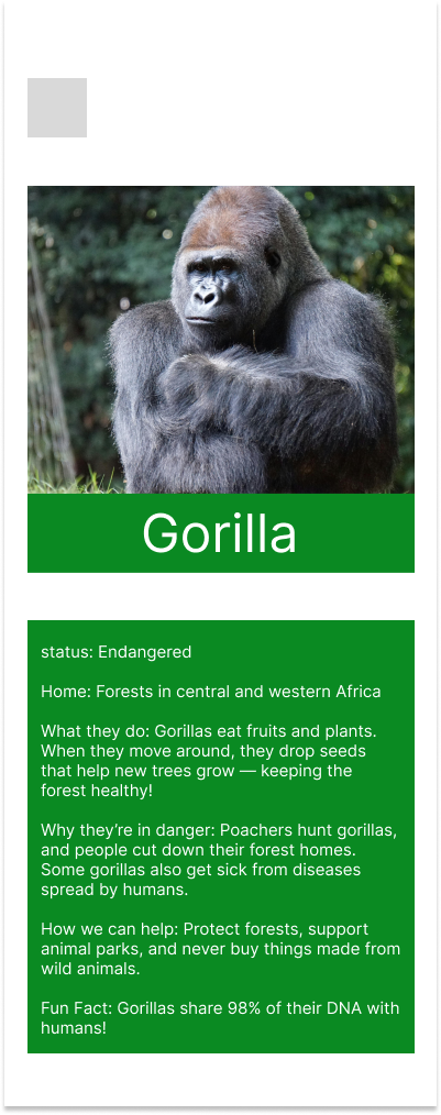
As my lecturer mentioned in my feedback the National Geographic does this very well in their designs which is something I decided to look into more. Quickly I found relevant information to my project which is sorted into small sections with information shown in illustrations and icons. This is something I need for my app to reduce the amount of text for my target audience. The information here is actually very similar to what I had in the mobile layout for the Gorilla inside the ‘animals’ page.
During research I also found a national geographic page specifically focused on animals for kids. This is actually very similar to what I originally planned for expect mine was to show endangered animals where this one put them into category's etc. Their text is pretty detailed too but I still think I should reduce it.

Tablet redesign
After getting feedback on my second redesign I was then recommended that my design will look a lot better on a larger screen.
This immediately looked a thousand times better just with this quick mock up example shown.
Before

After

Feedback
At the halfway critique, I felt behind due to frequent redesigns and changing ideas. Feedback from Miro focused mostly on map errors and reducing images, which conflicted with earlier advice to use strong visuals. My lecturer gave the most useful input: reframe the “quiz” as a more engaging “learning story” and explore presenting it as a VR-style experience in a Figma prototype. While I like the VR idea, I was concerned about making it convincing and managing time with ongoing redesigns.
VR Redesign
I have never designed anything VR related so I did wonder how I would go about this, which I plan to make a start now and then bring it back to show to my lecturer, just to see if my design looks like the idea of it being VR.
With this I can make it more interactive rather than a quiz which I think would work a lot better for my set target audience. I am also a VR user so I know what things should look like such as menu and icons.
I want to keep a similar structure to what I had with the ‘level’ select of different continents but this will be redesigned also.
For this VR design I thought of doing possibly three slides of information per animal for their introduction, then it will lead to a interactive point, click, lean type section. I would also like this to be narrated like a documentary as there will be lots of text but having it narrated will be way more suitable for kids.
I had a idea for a ‘point and click’ section, which I would like the user to be able to move their VR controller which when they are pointed towards a certain part of a animal (for example a elephant trunk) it will reveal a close up image with information. I think having three interactive elements would be enough then for the ‘story’ to continue. For it being in VR I also think having a tutorial is important as VR games etc can be so different than one another.
Sketches
At the halfway critique, I felt behind due to frequent redesigns and changing ideas. Feedback from Miro focused mostly on map errors and reducing images, which conflicted with earlier advice to use strong visuals. My lecturer gave the most useful input: reframe the “quiz” as a more engaging “learning story” and explore presenting it as a VR-style experience in a Figma prototype. While I like the VR idea, I was concerned about making it convincing and managing time with ongoing redesigns.


Designing the narritive
To make I start I reused some elements to bring it into a ‘story’. I also looked for new images what would work on the large scale and to help get the idea that the animal is moving.
This was my first version of the Elephants introduction, the box with text will be narrated and change for different facts. The bar in the middle is a placeholder for the menu which will later have icon buttons.


This was later changed to cantered longer boxes. This makes the text easier to look at and read along. However it is more content to read but this will be narrated for the user.
Before
After
I then used my original image of the elephant and created outlines of ‘key features’ which included its ears, tusks and trunk. To design this I created a master frame with all the outlines, I then copied this frame 3 times (one for each part and deleted the other 2). Then on the master I prototyped each part to ‘on hover’ and change to whatever part it is. So it will start of as a normal Elefant but when the user hovers over the ears they will have a white outline around them.
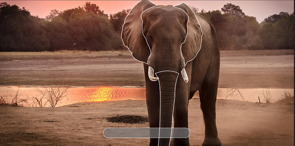
I then created new frames with the highlighted parts along with the information of the part and a close up image of it. I prototyped the highlighted frame to ‘on click’ then navigate to the frame with the matching information box. I tested this as a prototype which it worked very well.

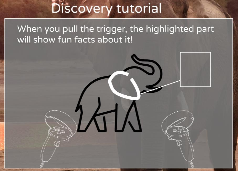
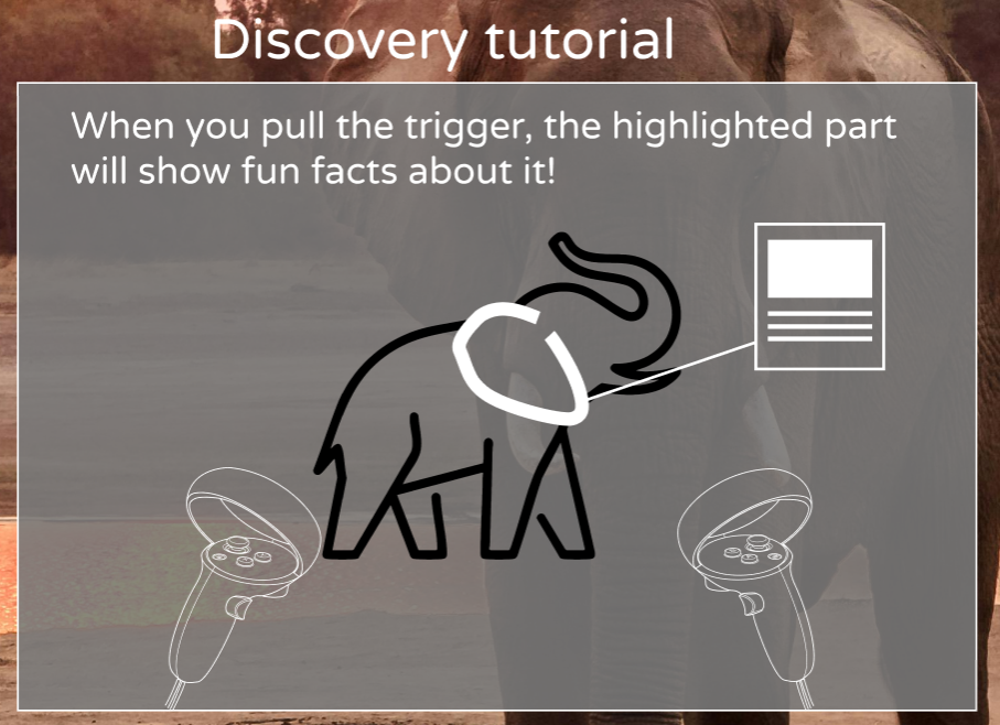
With the first interactive element now working I then remembered about the tutorial. For this I used Meta Quest controller icons from Figmas community uploads. I also found a nice Elephant outline icon I could use just to display a ‘animal’ in the tutorial.
For the first slide of the tutorial I wanted to tell the user their first step on how to find the ‘hidden’ information, which was just to point at different areas of the animal.


Next I wanted to tell the user that when they see a white outline, they can press the trigger to view the information. I included icons for both the left and right trigger for different users. I also made it so the trigger highlights in blue as not all users may know what a ‘trigger’ or ‘RT’ means.


For the last section I wanted to describe what happened when the user clicks on the highlighted part and display what this looks like. All this was prototyped using timer ‘change to’ with smart animate.
VR Feedback
After working on this for one week I wanted to show my lecturer just to get his opinion of if it works and if he gets the idea if it is a VR product. My lecturer said what I have is good and sometimes ‘you have to fake it to make it’ as I cannot make a actual working VR product in Figma.
However I did recieve new valuable feedback on to make my text bigger as 40 is the minimum for VR which is what I had. But for kids reading I think it would be very important to upscale the text. I was very happy I got this feedback to apply this.
I was also recommended to make the content and boxes bigger, even possibly full screen.
My lecturer also gave me a idea on a new ‘immersive experience’ feature, a button in the corner what clears all the UI so it does actually look like the animals are in front of you in real life.
Continuing my design
I used the same process of what I had before to create a intro and a point and click discovery section for more animals.
Sometimes I found it hard to find good images at large scale so I brought them to Photoshop and used AI to expand the backgrounds to make the animals further away with more background, so it looks more natural.

Before

After
The last page of the narrative story rewards the user with a badge of the continent they explored. This was something I wanted to add so the user gets excited and would want to continue playing this game to collect all seven continent badges.
Once I had all the animal frames for Africa created I then went to prototype them which I had to adjust the timers so the frames will auto change with enough time for text to be read and narrated. I also used black frames for transitions which will fade in and out so that the scenes between the animals change nicely.

Designing the menu
Firstly I wanted to create my home page For this I want a large scrolling frame at the top to display different content. I think I could use this as shortcuts for what I have working in the prototype. I also wanted to include a ‘Life on land in the news’ image but I don't know if I will get this working depending on how much time I have left.
To start the home page navigation I created a blank frame and created one large rectangle for the main content, and one thinner rectangle for the nav bar. To create the scrolling topics I created a component with variants which changed after a delay. I also added clickable arrows for the user to flick between it.
For the home page I also added a virtual home which is something meta does just to give it more of a VR app feel and then goes full screen when the user enters a experience.


Designing the 'Explore' page
To make my main content accessible I needed a page for the user to access the continents to explore. For this I wanted to use nice imagery featuring a animal from that continent what is endangered. I also created components to when the user hovers the selected item highlights and the image expands (This was used again for other buttons on the home).

I made Africa the selectable option for this prototype as it is the only one I have created a ‘story’ for. When the user selects a continent it will display a prompt before entering the story to ensure that easy miss clicks don't create pain points. With the prompt the user can press ‘begin exploring’ to launch the story.


'Animals' page
The next page I wanted to create was a page to feature some of the endangered animals what life on land. I think a nice way to filter the content is by animal types (mammal, bird, reptile and amphibian). Then when the user clicks into a topic there will be a longer list of animals the user can learn some facts on.

Taking inspiration from my old mobile/tablet layout I want to go with the gorilla again. I wanted to keep the facts here short and simple such as how tall the animal is which you can then use the AR to view it ‘in your home’. I also wanted to create a endanger status meter and a reading if the animals population is increasing or decreasing to raise awareness of this important topic.

The main feature here is the Augmented Reality (AR) which this will use the VRs pass though (Using the VRs camera to display real surroundings with added VR elements). Something I considered for this was creating a a popup to request access to use pass through as this is a requirement, the same way your phone would ask for permission for photos etc.

Going about making and presenting a ‘believable’ AR page is something I found quite tricky at first. Originally I was going to use a png cutout of a gorilla and put it over a photo of my living room. However I could not find a nice image what would be believable. I left this for a while and thought about it. After some thinking I thought I would try AI which I used a Adobe Firefly AI prompt to image software. This took a few attempts to get right but after some manual editing I got a really nice result of a ‘realistic’ but digital Gorilla in a AR experience.
I created these images using the AI which I am very happy with the results as it looks real enough that it is a AR experience, especially the digital lines around the gorilla which is a small detail but I really like this. I created one with no Gorilla just to add a ‘loading effect’ in my prototype.

Edited - Removed Gorilla

Edited - Removed AI mistakes
Icons
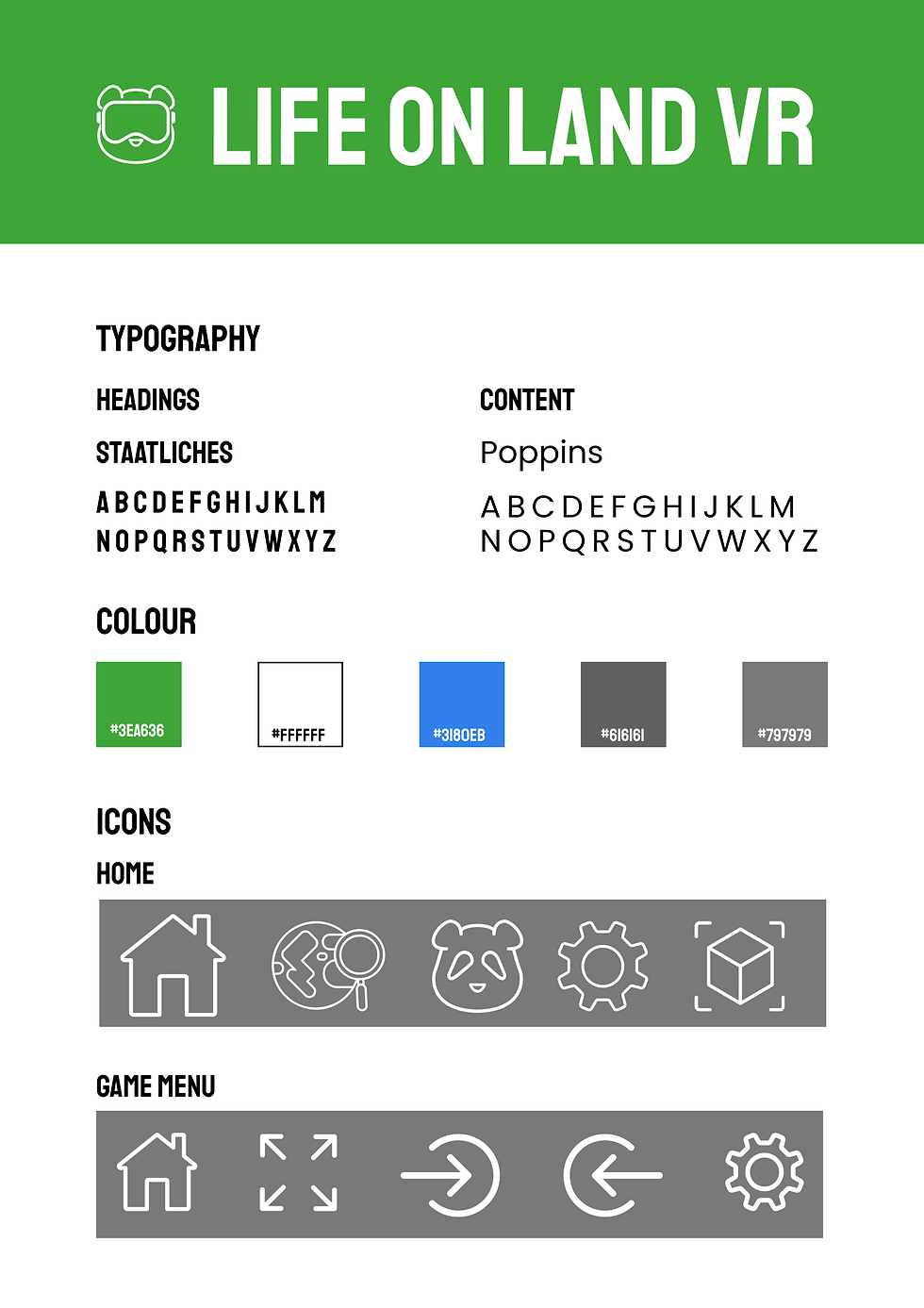
During this I also started to get icons together which I wanted my icons to match the style I already had from the ‘VR tutorial’ using while outlined icons.
The most important set I had to put together was for the nav/tool bar during experiences which I already had a placeholder for this.
First I thought of what I may need in this nav bar what would relate to the experience. First and most obvious is the home button to return at ant time. I also thought of ‘skip’ and ‘back’ buttons encase the user ever wants to redo the story and go to their favourite section easily.
I also want to add a ‘immersive’ mode from my feedback which will remove all UI elements to make the user feel like they are really there with the animal so I need a icon for this.

This is the icon component which on hover the icon will tell the user what it does. I felt like this is very important for a child audience too especially with buttons which are not very common. For example ‘immersive’ doesn't really have its own icon like a ‘home’ icon would. I also labelled the ‘immersive mode’ as ‘Hide buttons’ as a child may not know what immersive means where ‘hide buttons’ tells them what it does.

I was able to use the ‘home’ and ‘settings’ icons for my home page. However I needed a icon for animals and explore. For animals I want a nice simple animal, probably their head for simplicity for a menu icon. I think a Panda bear would probably work well as they are a example of once critically endangered to ‘vulnerable’ thanks to massive conversation efforts.
Branding
For branding such as a logo and title I wanted to title it ‘something’ VR. After some thinking I think the best option while being very simple was ‘Life on land VR’. It tells the user what the app is and what platform it is for.
Since I was running low on time before the hand in I reused the panda icon and added a VR headset over its eyes which this worked very well as a ‘mascot’ logo which would target the audience quite well.
I also needed a nice typeface which I used ‘Varela Round’ for content text and ‘Staatliches’ for headings.
Varela Round is a nice friendly font thanks to its soft rounded design which is also easy to read, especially with lots of content at once (which will be narrated also).
Staatliches is a big and bold typeface, it contrasts Varela by using sharp edges and bold letters. This will be used for headings on the home page for accessing different pages from the nav bar etc.
User Testing
User testing should have have taken place a lot sooner but since I learned of it in week 11 which I had most of my prototype finished I thought I would add the final touches before taking a user test.
As I do not have access to anyone in my target age group I asked a friend who is a VR user to test my app. This is why I thought he would be a good tester as he could understand the vision more rather than just being flat screens.
For this test I wrote a app description, story for a ‘persona’ and four tasks to complete.
App description - This app is a VR experience to educate children on SDG 15 ‘Life on Land’. In SDG 15 they target to strengthen global action against poaching and wildlife trafficking by empowering local communities with sustainable livelihoods, curbing demand and supply of illegal wildlife products, and urgently protecting natural habitats to halt biodiversity loss and prevent species extinction.
This app is designed to educate children on wildlife, especially endangered wildlife, why they are endangered or poached and why wildlife is so important to the world.
When using this app visualise it being in VR, you can fully look around the animals habitats, moving videos and you interact with them and have the ability to meet the animals in your own home using AR.
Story
You remember watching a wildlife documentary at school and feeling amazed by the animals on the screen. You have always loved animals, so learning that some of them only have a few left in the world made you feel sad.
You began to wonder why they are disappearing and if there is anything you can do to help.
Now, you are stepping into their world to learn their story and protect life on land.
Task 1
At school the documentary was about African wildlife, your favourite animal was the Elephant, you want you to explore Africa using the ‘Explore’ menu, watch the intro, then take the tutorial since you are new to this VR app and then find out why elephants need their tusks and why they are poached.
Task 2
You start to find the UI a bit distracting, you want to feel like you are really standing in Africa but the menu is taking away from the experience. While you are on the elephant you want to enter the ‘immersive’ mode to hide the menu then return back shortly after.
Task 3
You have now learned about the elephant, you want to continue this story to learn about more animals you were maybe not aware of. Use the ‘skip’ feature to skip to the ‘Pangolin’ and find out why they are important to the environment and how they are endangered. Once you have learned this use the continue arrow to get your medal and return home.
Task 4
Lastly you want to meet a animal in your own home using AR. You want to see a gorilla in VR because gorillas are a lot like humans. They have families, care for their babies, and show feelings like happiness and sadness. They can use their hands, make expressions, and even communicate with each other.
Seeing a gorilla up close would help you understand that they are not so different from you—and that makes you want to protect them.
Once you have the gorilla in AR you can stop the test.
User test Evaluation
From this the user did navigate fine, however they clicked lots skipping over content. After the test they told me they are a very fast reader which I explained the slides take a bit to change as it is children reading and a narrator will talk (which he knew before the test).
Result link:
https://www.mediafire.com/file/6wke3zqplppukjo/nathan-ar-test-recording.mkv/file
Deliverables
This project was a very tough one for me which at the start I spent lots of time designing layouts, then having to redesign the layout entirely and for different platforms. This was very stressful as for a while I wasn't really adding new content as I was redesigning layouts. My final design also had a lot of screens which took a while to prototype all the screens together and timing the frames correctly. I wish I could have added the audio in the prototype however I just added it into the video.
Something what I learned from this was to explore every option possible not just to stick with the ‘norm’ such as creating a mobile ‘game’ app. When noting down my ideas at the start I will look into further into possible device choices so I am not constantly redesigning of feedback. I am very glad of this feedback as it does look a lot better imagining it as a VR experience.
